
Design Decisions : House D
- Lisa Twyman
- Jun 9
- 2 min read
Read on for the design hacks we used to overcome some existing blah moments on this renovation, as well as some tricky problems we needed to solve...
First off, this home was dreary and in need of a personality. We decided to use texture and some well placed pops of colour to bring it to life. We did keep it light and breezy with minimalism in mind to ensure a timeless design.
The passageway to the bedrooms was not a very uplifting zone of the home. In general I dread long narrow passageways. Sometimes, however, they are unavoidable in renovation projects. In the passageway of this home we replaced the standard doors with full height ones. This change immediately makes the area look more architecturally interesting.
Furthermore, in this case on the one side of the passage the lower height doors had to stay due to a ceiling slab height on this side of the house. As a solution to this asymmetry, we placed a striplight in a ceiling recess above these lower height doors. This made the difference in the door heights look intentional, as well as serving as a minimal lighting solution in this narrow area.


Another one of my dreads is a braai / chimney that looks like this:

That large opening is not in proportion to both the chimney breast and the rest of the space. The question was whether we could make it smaller, and still have a functioning chimney flue. These homeowners were planning on using this frequently as a cooking space in their entertainment zone, so being smokeless was a priority. By creating a narrowing inside the flue we increased the pulling action of the chimney. We also lowered the height of the opening significantly, to achieve a more streamlined look.
Of course we tested the draw of the chimney before we tiled the wall...

The en-suite bathroom for the littlest member of the family did not have a lot of natural light. We wanted to introduce colour in this room, without dulling the available light. To overcome this problem, we added the colour on the walls in a striped pattern of tiles, using white along with the soft pink.

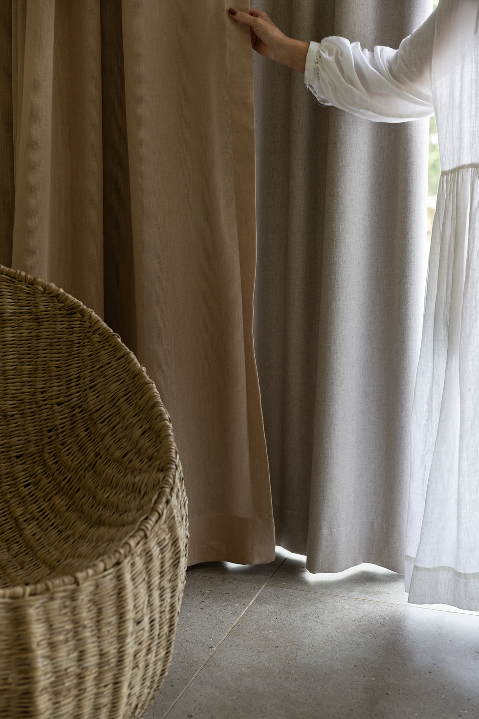
One thing the home owners couldn't agree on was whether to use blockout or sheer curtaining in the bedrooms. No problem! We did both - on a double rail - so they can use one at a time or both according to their sleep requirements.
Each renovation project comes with it's particular design problems, and we love the challenge and variety of this type of design work.
We have completed a number of full residential and commercial renovations, and aside from the challenge of project management and keeping the project on budget we always look forward to the next one.


Comments